Blog_Spotify_and_SpotifyR

SPOTIFY - INSIDE THE API WITH SPOTIFYR

SPOTIFY - INSIDE THE API WITH SPOTIFYR
by Ditty Sept 2018
Keywords: Spotify, AP handling, Clustering, Sentiment Analysis, Time Series
Introduction - What is going on 
At the Data Artists creativity is close to our heart. Just as data, we love to incorporate it into as many aspects of life as possible. Then in 2018 we had the opportunity to start an independent record label (The Data Artists Music) we had the ambition to combine our love for data - and of music. I was lucky enough to have the opening honours for the label with my debut album: Somewhere in Between. Also referencing to the combination of creativity and data science. As these are traditionally seen as two separate worlds, that are difficult to bridge. As Forbes pointed out the music industry (sales) was worth about $19 billion. 

The album is available on vinyl and on all major digital platforms. After analysing the results of the first release I was interested how data science could help manage the creative process and the distribution process. Hence, I started investigating the Spotify API to see what insights could be derived from there. And of course: also to have some fun while learning some new techniques.

To give you an idea what kind of music we are releasing on the label, you can check the Spotify plugin below and for the vinyl fans, there are some pictures of the different vinyl packs. 
Objective & Limitations
During last summer I observed a #challenge going on in The Netherlands on the social networks, where people were asked to place 20 albums in 20 days that influenced their musical. From a personal perspective I'm not a big fan of such challenges, but for this one I had the Spotify API in the back of my mind. So after being invited by a close friend, I went for it. 

As I was creating the posts I found that more than 20 albums influenced by musical taste. For the challenge on social media a problem and great for this analysis. After composing the list I came to a total of 63 album. Based on the Spotify documentation and readability of this research the analysis-set will randomly be reduced to 10 albums. And if it works for this subset, we can in a later stage scale and enhance the procedures (code).

My objective for this research is to give insights towards how my musical taste developed and from their formulate future, more detailed research questions. In that sense a limitation would be that I will solely use my data as a user-case.
Research Question - what to better understand
For this research the following research questions were formulated
Main Research Question:
What are the characteristics of music I like?

Sub Research Questions
how can we obtain characteristics (measurable features) of music?
what are the measurable features of which music consists?
how does emotion relate to measurable features?
how do features develop over time?
what are areas for feature enhancement?
In the first part we zoom into the data collection process and how the data is processed. In particular we pay extra attention to connecting to the Spotify API and the available documentation. After that in the second section we describe how our data set was constructed by explaining the random sample and the feature selection process. In the analysis part that follows we then analysis two specific features namely 'Energy ' and 'Valence' and how by combining these metrics Emotional Quadrants (Thompson 2015) emerge. Furthermore we also analyse how these metrics have developed over time by presenting a time series - based on album release dates.

Next to the features 'Energy ' and 'Valence' the musical keys from our data set are also analysed in terms of similarity and differences between albums and artist. (In our case those are interchangeable as in our sample data set each artist occurs only once)

In the last part of the research we propose an enhancement with the introduction of 5 new features, which can be used and assed in future research. 

With the use of R (language and environment for statistical computing and graphics) I will be using data science technique and methods like descriptive statistics, cluster analysis, sentiment analysis and API handling. The insights can be used to contribute to a better understanding of musical preference - and the underlying constructs of the music that determine preference.
Let's get staRted - Data collection & Manipulation
As mentioned above the main research data consists of 10 randomly chosen albums that influenced my musical taste. This data is then matched to the available (meta)data in the Spotify API. For connecting with the Spotify API we will use the SpotifyR library by Thompson, Parry and Wolf (2017) in R. A great introduction for using this library is given by Mia Smith in 'What is Speechiness' (2018). 


With the use of the SpotifyR wrapper it is relatively easy to extract artist, album and song information form the Spotify API. The API documentation from Spotify is available at the Spotify for developers page. There you can also use the console section if you want to (manually) query the API. Note that here you also need to register your app to receive an access token. You will need that token for every query. Below you can find an example of the Spotify API console. Where you van manually enter search fields and the response is given back in de console right.

Managerial Implication

In my daily practice I see that the traditional data (science) lanscape witin organisations is changing. Were tradiotionaly your data science team was bound to a central data warehouse (and longer IT deliverly) that incorporated your company data - theres is now a noticeable trend towards a hybrid from with the use of connecting to API's


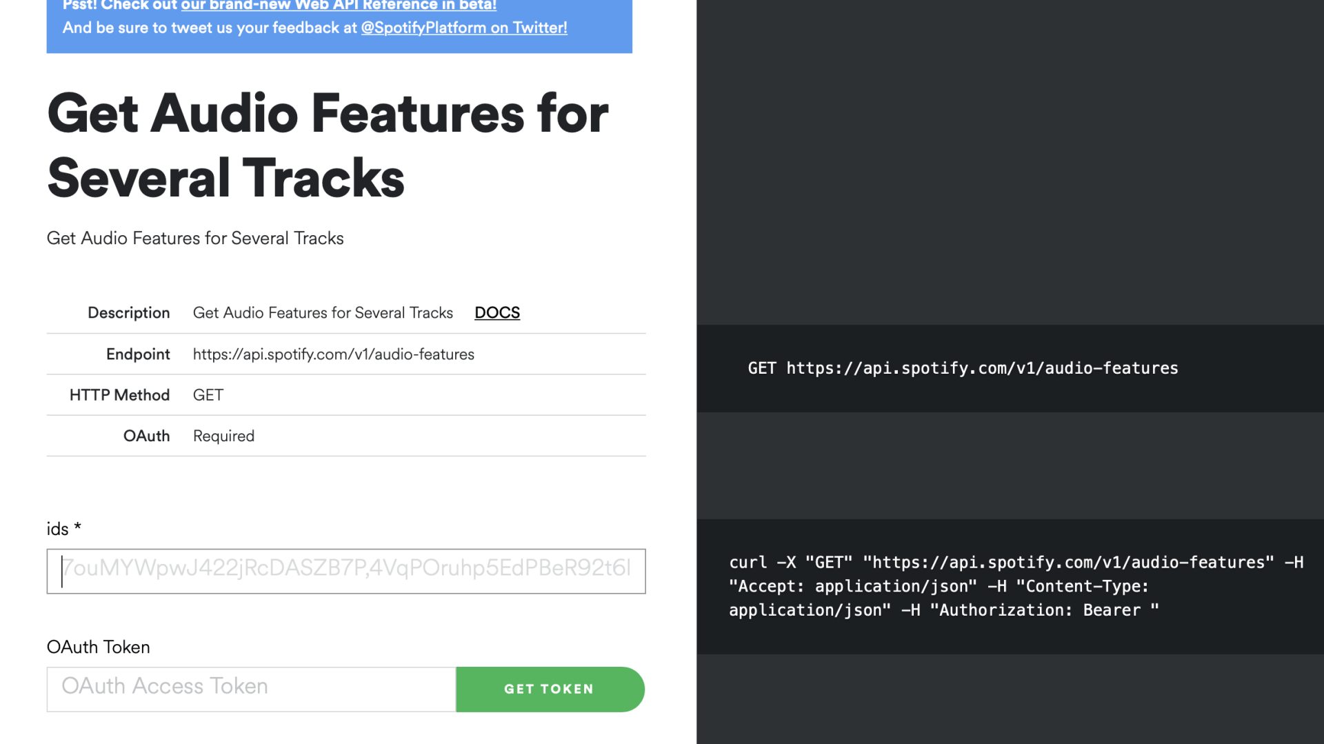
What are API's? API stands for API stands for Application Programming Interface. As Shana Pearlman desciribed it: "API is a software intermediary that allows two applications to talk to each other. In other words, an API is the messenger that delivers your request to the provider that you're requesting it from and then delivers the response back to you. 


An API defines functionalities that are independent of their respective implementations, which allows those implementations and definitions to vary without compromising each other. Therefore, a good API makes it easier to develop a program by providing the building blocks.


Let's get staRted - Data collection & Manipulation
The SpotifyR library in combination with the Spotify API allows you to go trough the meta data in a fairly straightforward manner. The image below gives you an idea of the possibilities and which functions are in the package. The overview is directly printed as part of the package from my R console. Here you can see that there are functions to call for album characteristics, artists etc.
Random sample: 10 albums
As mentioned in the introduction the challenge consisted of naming 20 albums and my total list consisted of 63 albums, and for this research we will further investigate a generated random sample. Consisting of the following albums: 
  1. Apparat: Walls
  2. Deftones: Adrenaline
  3. Guns N' Roses: Appetite for destruction
  4. Last Days Of April: Angel Youth
  5. Nathan Fake: Drowning in a sea of love
  6. Pantera: Vulgar Display of Power
  7. Prince: Purple Rain
  8. Rufus Wainwright: Release The Stars  
  9. Soundgarden: Superunkown
  10. The Smiths: The Queen is dead 
You can listen to the albums in the player below.
Feature Analysis: what data is available in the Spotify API.
Now that the Spotify API link is set-up, we've gone through the functions of the SpotifyR wrapper we need to have a better understanding on what data (features) are available in the API. A simplified representation of the  Spotify API is given below, here we see that we can retrieve data on the following "subject areas". (As distilled from Spotify API Console).
  • Albums
  • Artists
  • Browse
  • Episodes
  • Follow
  • Library
  • Personalisation
  • Player
  • Playlists
  • Search
  • Tracks
  • Shows
  • Users Profile
Relavant Areas
For this research we will be looking at combining data from the following three subject areas, as we want to investigate (a) individual songs, (b) the album they are on and (c) the artists that has written the song 
  1. Albums
  2. Artists
  3. Tracks
Analysis Set
After going trough the API documentation the following features were selected for this analysis::

[1] artist_name, [2] album_release_date, [3] album_release_year, [4 ] danceability, [5] energy,, [6] key, [7] loudness, [8] mode, [9] speechiness, [10] acousticness, [11] instrumentalness, [12]  liveness  [13]  valence ,[14] tempo ,[15] duration_ms , [16] track_name , [17]  track_number,[18]  album_name, [19 ] album_id, ,[20]  key_name  [21]  mode_name, [22] key_mode.  
Results 
Now that all the data is available in out R environment we can start by visualising the data. Previous research done by Thompson(2018) shows that by crossing the valence and energy axes emotional quadrants can be identified. So, let's have a look at the meta data of both features. In other words what the  Spotify documentation says about both features, which seem to be constructed features by the Spotify team. 

Metrics for Analysis
"Energy: is a measure from 0.0 to 1.0 and represents a perceptual measure of intensity and activity. Typically, energetic tracks feel fast, loud, and noisy. For example, death metal has high energy, while a Bach prelude scores low on the scale. Perceptual features contributing to this attribute include dynamic range, perceived loudness, timbre, onset rate, and general entropy." (Spotify)

"Valence: is a measure from 0.0 to 1.0 describing the musical positiveness conveyed by a track. Tracks with high valence sound more positive (e.g. happy, cheerful, euphoric), while tracks with low valence sound more negative (e.g. sad, depressed, angry)." (Spotify).

The figure below shows that results of crossing valence and energy for the analysis set with their quadrant typology. Results show that most songs fall into "Turbulent/Angry" category followed by "Happy/Joyful", "Sad/Depressing" and "Chill/Peaceful" forms the smallest category.
The image above gives us a good overview of how all songs and albums are evaluated across the Energy and Valence axis. Hence we would also like to create more insights on the individual albums, to further investigate how albums are composed in terms of the emotional quadrants. Looking at the results and being an expert on my preference intuitively and visually the categorisation makes sense.I do rock out on Prince when I'm feeling happy, Guns and Roses when somewhat angry and Rufus Wainright when I feel sad. 

As can be seen, a lot of songs (and albums) fall into the "Turbulent/Angry" category. Unfortunately we are not able to see the exact metric-values that construct this category, however for future research it might be interesting to further analysis this quadrant to investigate if sub-clusters exist. While I can imagine that dance songs will generally score high in energy level (with high tempo, dynamic range etc) and less on valence (which might be caused by less detectable features like voice, instruments etc). Classifying this as "Turbulent/Angry". Which might not be a good categorisation. 

Concluding the image above does provide a a good (initial) overview on how my preference is constructed, and the image below does the same per album.
Energy and Valence over time
Now that we have established how my total musical preferences is constructed by the associated emotions it would be interesting to further investigate how these metrics developed over time. 

The figure below show the average value of the metric Energy per album and the average value of the metric Valence per album over time, based on their release data. Where we note that for future time serie analysis we might need some enhancement as release data of albums does not in all cases relate to age. E.g. I started listen to The Smiths and Prince about 10 years after the records came out. However the graph below, does give a clear general impression of how the metrics developed over time. As a preliminary conclusion it might be safe to say that with age comes (more) mildness.
New Metrics: Emotional Range & Emotional Densities.
Now that we have established a greater insight on how songs, albums and artists are distributed across the emotional quadrants. We would like to further investigate the possibilities of constructing new features based on our current data set that might provide additional insights. In this regard we propose to add 4 new features on the basis of which we can further compare albums / artists. Note that in this research album and artists are inter-changeable features, as every artist occurs only once in our analysis set. In the line of Spotify provides metrics, we will also create these features with values ranging from 0 -1.

Emotional range: Indicator between 0 and 1 to indicate how many emotional quadrants are touched by an album/artist combination. Low
values indicate that the album / artist is has less associated (different) emotions. Higher values indicated that the album / artist has a wider spread in (transferred) emotions.

Emotional Range:
Em_R: n-distinct emotional quadrants / n emotional quadrants


Emotional Density: Indicator per emotional quadrant ranging between 0 and 1indicating the attribution of each emotional quadrant for 
     album / artist.

Emotional Density Sad Depressing:
Ed_SD: n-songs emotional quadrants 'Sad and Depressing' for album_ artist / total songs for album_ artist


Emotional Density Chill Peaceful:
Ed_CP: n-songs emotional quadrants 'Chill and Peaceful' for album_ artist / total songs for album_ artist


Emotional Density Turbulent Angry:
Ed_TA: n-songs emotional quadrants 'Chill and Peaceful' for album_ artist / total songs for album_ artist


Emotional Density Happy Joyful:
Ed_HJ: n-songs emotional quadrants 'Happy and Joyful' for album_ artist / total songs for album_ artist

Emotional Range
Let's have a closer look at the outcome of our calculations for the emotional range value.The figure below show the emotional range per artist. Where n represents the number of emotional quadrants that are touched upon (emotional depth). Here we can see that Prince and Rufus Wainright have the highest (and maximum) emotional range, being 1.0. Implying that all four emotional quadrants are articulated in their album. In other words they relate to more emotions in their work. We see that Last Days Of April and Guns and Roses score lower on the emotional range scale, being 0.5 Meaning that 50% of the quadrants is detectable in their albums.
The figure below show a visualisation of the Emotional Range for each Artist/Album
Emotional Density (Ed_CP Ed_HJ, Ed_SD, Ed_TA)
Let's do the same for the Emotional Density features. The figure below show the emotional density per emotional quadrant per artist. Where n represents the number of songs for a specific artist associates with an emotional quadrant and density indicates the value of that quadrant. Here we see that for Last Days Of April, 1 song is categorised as 'Sad and Depressing' (Ed_SD=0.10) and 9 songs are categorised as ' Turbulent and Angry'(Ed_SD=0.90). 

In general these indicators (Ed_CP Ed_HJ, Ed_SD, Ed_TA) are the relative contribution of each quadrant to the total. This might seem superfluous to add these as separate new features to the analysis set. However in this research we do not want to constraint ourselves. 

In future research if we were to build a regression model (for instance amount of plays), we could statistically test for Multicollinearity in our analysisset. In short this is a statistical; test where we can determine how features in our analysis set relate. The strength of the relation between the features is important in determining the 'added value' constructed features in a model. That's all for a later stage. For now we want to explore different data angles. 
The figure below show a visualisation of the Emotional Density Metrics
Usefulness of new features.
Now that we are familiar with the newly introduced features. It might be helpful to get a better understanding of our new features and how they relate to the API features. (We do need to note here that we will only be comparing this data for 10 cases. Statistically speaking making claims on these findings will make less sense, however to understand what is going and also a reference to real life situations - to illustrate how you would investigate your data by looking at the correlation between them.) The figure below shows the correlation matrix of the API features and the newly constructed features. As can be seen the Emotional Range feature might be interessting to further investigate , however the Density features might be less useful. From a broader perspective we also need to conclude or further investigate 
if averaging song features and then attributing these feature values to artists is the right perspective for this analysis. 
Key Usage
An other interesting aspect in analysing musical preference can be done by analysing the key of a song. In this section we will have a closer look at the keys that are used in songs and how they are distributed. This might give us hints if musical preference might be influenced by keys. The image below shows how key-usage is distributed. Here we see that major keys, consisting of A major, B major, C major, D major and G major form large part of the entire amount of used keys. 
The image below we look at the distribution of keys for each artists. Here we can observe that Soundgarden's album Supernatural mainly contributes to the high amount of C major key used.. For G major this is mainy caused by Guns and Roses' Appetite for destruction. For future research it might be investing to compare these finding against a rondom sample of other albums. Helping us statistically determining if there is a significant relation between key usage and musical preference. 
Conclusion 

In this research we investigated the characteristics of available features from the Spotify API of music that I like. We found that by crossing the features Energy and Valence an Emotional Quadrant framework can be created. From which we are able to categorise songs into four classes: (a) Turbulent/Angry, (b) Happy/Joyful, (c) Sad/Depressing and (d) Chill/Peaceful. Where from my preference the greatest part of the songs fall into the 'Turbulent/Angry' category. 

In the second part we looked at the Energy and Valence features over time. Here we found that over time my preference seems to change in terms of energy and valence. Implying that with age comes (more) mildness. Which intuitively also makes sense.

Based on the Emotional Quadrant Framework we investigated if it was possible to construct new features (based on the framework' s categorisation) that may be used in future research. Hence, we introduced 5 new features. One for Emotional Range and 4 (one for every Emotional Quadrant) Emotional Density features. A preliminary conclusion here (by means of the correlation matrix gave us hints that only 'Emotional Range' might be interesting to further investigate. We need to note that we in our case there were only 10 cases, implying that further research is needed towards claiming the statistical value of the newly constructed features.

In the final part of the research we investigated the distribution of musical keys across the music I like. Here we found that the majorKeys are popular in my musical choice. For future research it is favourable to statistically check on significance between groups (against a random sample of the entire Spotify catalogue) in oder to determine if my musical preference can be discriminated by on key usage.
Future research
A limitation of our investigation is the timeframe of our analysis set. The background of this limitation is that at the time of analysis this Nice insights that forms the basis for developing future research questions. In particular in terms how groups statistically differ. And if there is a statistical relation between for instance on one hand features as 'Energy' and 'Valence' and also the newly constructed features Emotional Range and Emotional Density and on the other hand influencing 'Plays' or 'Popularity'.  
Concluding remarks
With this research I hope to have made you enthusiastic about adding API's to your Data Science Toolkit. For me, as somewhat a dinosaur in the field - the endless possibilities in working with vast amounts of data never seems to stop an amaze me. 

At the same time I also see a managerial implication concerning the 'more or less data is better'. discussion. In my perspective this should alway be a balanced consideration, as data science initiatives can be fruitful,  costly and fail miserably. In practice to manage the 'more or less data' discussion I look at goals of data science initiatives and the alignment with innovation horizons. Where different horizons (McKinsey’s Three Horizons of Growth Model) have different requirements.

 In my research on the bushfires in Australia - you can read more on this topic. (managerial implications section).
Hope you enjoyed reading! 

All the best,

Ditty

Ditty Menon, The Data Artists, Ditty

About the Author: Ditty Menon

Founder of The Data Artists, The Data Artists Music and Nederland Wordt Duurzaam


Erasmus University Rotterdam Alumni with 12 years of experience in Data Science / Analytics / Digital. Passionate about incorparating data into all aspects of life & (more recent) using data for a sustainable world.


Radom facts:

Starts his day with a flat white or caffe latte and the financial times podcast.

Broke his glasses when walking into a lamppost while thinking of a coding issue

Loves Serendipity

Share by: