Blog_Corona_Chinese_Outbreak

CORONA - THE CHINESE OUTBREAK

CORONA - THE CHINESE OUTBREAK
by Ditty April 2020
Keywords: Corona, COVID-19, Chinese Outbreak
Recap - follow-up of previous post.
This post is a follow-up to my previous post, where I presented the background and overview of interesting research topics to further investigate in these posts. All zooming in on  the Corona COVID19 pandemic.
Introduction - What is going on 
Since the Corona / COVID19 outbreak last December 2019 that started in Wuhan, China - a lot has been written about the phenomenon and it was confirmed as pandemic by World Health Organization on the 11th of March 2020. According to Johns Hopkins University 184 countries (at the time of writing this post) have.been affected by the virus and have registered cases of COVID 19. 
Objective & Limitations - Keep it small gradually increase knowledge
Based on the large amount of data and information (news, blogs, socials or official government documents) that citizens are confronted with - I sometimes found it difficult to distinguish facts from and opinions. Hence, I found myself analysing the Corona outbreak on a daily basis. Where I would try to fact-check statements of experts or politicians that I heard the day before on popular late night talk shows in the Netherlands. Like Jinek or Op1. All in order to try and make sense of the virus and the outbreak. 

From a statistical data science perspective pandemics are interesting subjects to study, as they cover a lot of key statistical concepts that we use in data science. Eg distribution theories, significance levels etc. My objective in this series of posts is to try and balance a simplification of what is going while also keeping it understandable for audiences that are less data-literate. Implying that it is preferable to keep research questions small and by answering the individual questions per post - we are gradually building knowledge about the virus and it's outbreak and at the same time are aiming to help readers become more data-literate.  
Research Question - what to better understand
For this series of posts I will be zooming in on the following research questions / topics: 

In this second post I will be having a closer look at how the virus developed in China? With the use of R (language and environment for statistical computing and graphics) I will be using data science technique and methods like descriptive statisticsgeo-spatial analysis and multi-variate analysis. The insights can be used to track and analyse the spread of COVID-19 in China. 


Let's get staRted - Data collection & Manipulation
Initially, while performing the analysis I used the data obtained from Johns Hopkins University's Github a place where they provide daily files with various information, e.g. number of new cases, number of death related to COVID-19 etc. This data is also forms the basis of their well-know dashboard that a lot of media use as main source of information in their articles. 

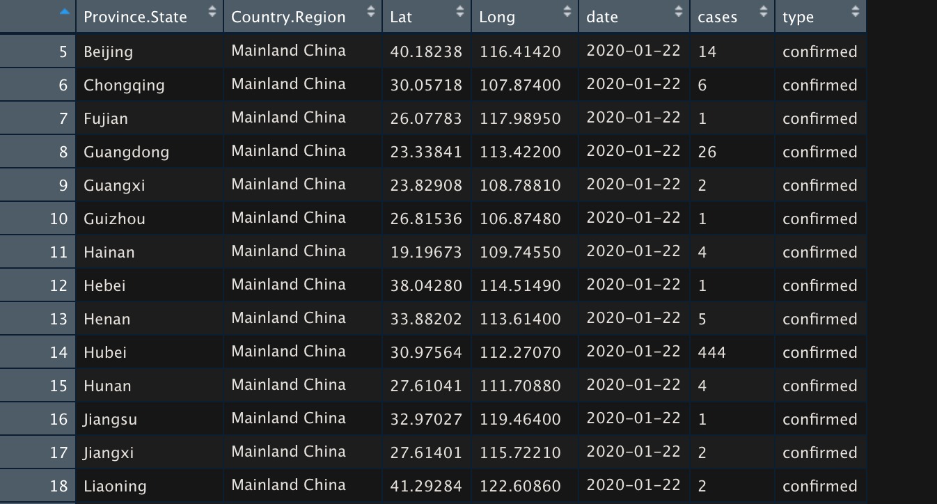
However halfway trough the analysis I learnt about the R-package called Coronavirus written by Rami Krispin. A wrapper that makes a data scientist life much easier, as it - in the background fetches the data from Johns Hopkins and there is no longer a need to have extensive code for obtaining and restructuring the data in my own code. Awesome! Very convenient as well is that longitude and latitude are also available features in that data. Meaning we can use these coordinates to plot the spread on a map.The images below shows the data available. The first image shows all available data and the second image you can see that for each province on a daily basis 3 'types' of records are presented, being the number of confirmed cases, nummer of deaths and the number of recovered patients  
Results 
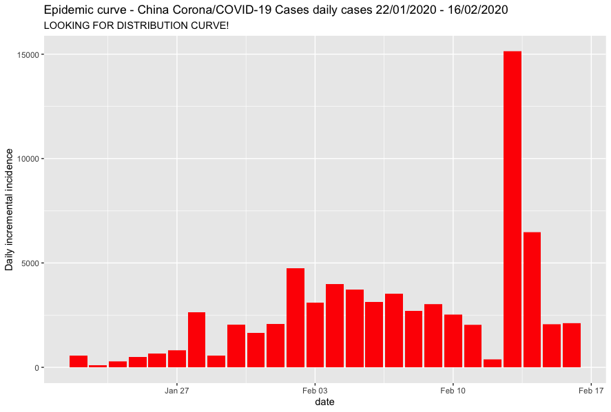
Now that all the data is available in out R environment we can start by visually inspecting the data. Let's start with creating a histogram of the daily new confirmed cases for the entire Chinese Mainland. This might give us insights on how the virus is developing across the country. The figure below shows some volatility in the development of the virus. Something that we wouldn't expect based on a basic assumption in virology, namely that of exponential growth.What we should be looking for from a statistic perspective is a normal distribution (bell curve). This might imply that we need to add more detail to the histogram by taking the perspective of the different regions, to find these bellcurves. (ps also very noticeable is of course the spike seen on the 13 of February - let's investigate that on as well)
Chines provinces
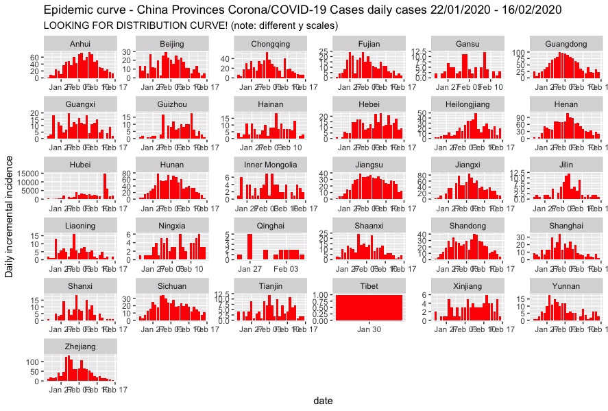
The figure below show the epidemic curves per chines province. Here we can see that the spike on a national level on 13 February is caused by the confirmed cases in Hubei. Being the province where Wuhan is located and the Corona/COVID-19 virus was fist discovered

Furthermore we seen that on a more detailed level in comparison to our first country histogram, that for provinces we discover more bell-shaped curves. Giving us hits towards predictability in a later stage. However it does need to be taken in account that we have a limited amount of days in our analysis set, and matching this to the assumption that the pandemic will have an exponential growth predicting the curve might be very tricky. Instead of focusing on predictability, let's focus on obtaining more insights on the spread.
Epic Centres
An other important aspect in researching the spread is to identify epic centres of the spread. Meaning that we can have a look at the relative contribution of each state compared to the national figures. 

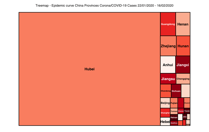
In order to identify the epic centres of the spread, different visualisation can be used. An option would be to add categories (being the provinces) to the histogram of the national figures. However keeping in mind that there are a total of 31 provinces this might become a bit messy. Therefore a treemap might be helpful with the identification of huge contributors to the national figures.Where the size of the category (in our case provinces) illustrates their contribution to the total amount of infections. 

In the treemap below can be seen the top 3 of infection ares are: (note that in the figure below the percentages are not displayed for readability purposes in terms of not showing all the 30 percentages)
  1. Hubei: 82% of the infections.(+/- 58k of 70K). 
  2. Guangdong:1,9% (+/- 1,3k of 70K).
  3. Henan: 1,7% (+/- 1,2k of 70K).
Based on the presented treemap it is might be interesting to 'translate' this to a geographical map. E.g. to see where the epic centers are located and possibly back-trail the spread of the virus between provinces. See below, which is used from wikipedia site (April 2020).

Interesting to see here, is that the Guangdong region (number two in terms of infections) is located in south-east of China and houses the Hong Kong area. Which may lead us to believe that the strong economic relations facilitated the spread of the virus. Furthermore we see that the number 3 region in terms of infections, Henan is a neighbouring province to Hubei.

Now having an idea how the virus spread it may be interesting to have an interactive map which also takes into account the de infections per day. 
Interactive world map
In the interactive maps below you can see how the virus spread across China by date. In the top left of the image you will see the date playing. Initially I produced the map using a world map as basis. However I found that this of course did not provide enough detail. Hence I added an other map which solely shows the China Region. The images below illustrate how fast the virus spread across China during the period of 21/01/2020 and 16/02/2020.
Conclusion
In this post were set off sail to investigate how the Corona / COVID19 virus spread in China in the period of 21/01/2020 and 16/02/2020.
Here we found that the Epidemic curve for China as total developed a-typical distribution in comparison to the expected normal distribution. Hence by adding a level of detail by investigating the separate regions we found more clues of normal distributions. Additionally we found that in the timeframe of 21/01/2020 and 16/02/2020  that the top three of epic centres consisted of 
  1. Hubei: 82% of the infections.(+/- 58k of 70K). 
  2. Guangdong:1,9% (+/- 1,3k of 70K).
  3. Henan: 1,7% (+/- 1,2k of 70K).
Were it could be hypothesised, as Guangdong houses the Hong Kong area that due to the inter-economic relations between Hubei and Guangdong the Corona/COVID-19 virus was at an early stage able to spread rapidly across China. Where Henan is located closer to Guangdong. 

In the final part we also presented an interactive map showing the speed of how the virus was able to spread across China in the period of 21/01/2020 and 16/02/2020.
Future research
A limitation of our investigation is the timeframe of our analysis set. The background of this limitation is that at the time of the analysis the Dutch spread just started to develop. From that perspective I wanted to keep groups comparable. Keeping in mind that my daily research endeavours were mainly based on statements in the media. Meaning that there was a fear that the virus may or is spreading as fast as it did in China. Therefor in this research I wanted to find support for such claims. For future research it may however be very useful to re-perform the analysis with more data and also look more at predictability of epidemic curves.
Concluding remarks - not an epidemiologists
Please note that I am not an epidemiologists and thus wary of relating the outcomes of my endeavours to the current situation. My aim is to create a better understanding about the virus and it's outbreak and hopefully help people (and myself) to place presented information in a more statistical perspective. 

Please also note that this post has not been peer-reviewed. The sole purpose of my endeavours is to present insights into the outbreak and how - with relative limited coding in R - it is possible to dive into the data yourself. Hopefully get you enthusiastic about the possibilities data science provides.
Hope you enjoyed reading! 

All the best,

Ditty

Ditty Menon, The Data Artists, Ditty

About the Author: Ditty Menon

Founder of The Data Artists, The Data Artists Music and Nederland Wordt Duurzaam


Erasmus University Rotterdam Alumni with 12 years of experience in Data Science / Analytics / Digital. Passionate about incorparating data into all aspects of life & (more recent) using data for a sustainable world.


Radom facts:

Starts his day with a flat white or caffe latte and the financial times podcast.

Broke his glasses when walking into a lamppost while thinking of a coding issue

Loves Serendipity
Share by: