Blog_Corona_Dutch_Outbreak

CORONA - DUTCH OUTBREAK

CORONA - THE DUTCH OUTBREAK
by Ditty April 2020
keywords: CORONA, COVID19, the Netherlands
Introduction, Recap and follow-up of previous posts.
In my first (introduction) post about the COVID19 pandemic I presented a framework for how we can gradually increase knowledge about this phenomenon with the use of some key statistical (and data science) concepts. In the second post I tried to zoom in to how the virus spread in China with use of data made available by Johns Hopins University. Then in the third post and fourth post I had a closer look at how the spread developed between countries in The Netherlands, Italy, Germany and Spain. In this fifth post I will investigate how the visus spread in the Netherlands and in particular between provinces. 
Objective & Limitations - Keep it small gradually increase knowledge
Based on the large amount of data and information (news, blogs, socials or official government documents) that citizens are confronted with - I sometimes found it difficult to distinguish facts from opinions. Hence, I found myself analysing the Corona outbreak on a daily basis. Where I would try to fact-check statements of experts or politicians that I heard the day before on popular late night talk shows in the Netherlands. Like Jinek or Op1. All in order to try and make sense of the virus and the outbreak. 

From a statistical data science perspective pandemics are interesting subjects to study, as they cover a lot of key statistical concepts that we use in data science. E.g. distribution theories, significance levels , exponential growth etc. My objective in this series of posts is to try and balance a simplification of what is going on while also keeping it understandable for audiences that are less data-literate. Implying that is preferable to keep research questions small and by answering the individual questions per post - we are gradually building knowledge about the virus and it's outbreak and at the same time are aiming to help readers become more data-literate.  
Introduction - What is going on 
Since the Corona / COVID19 outbreak last December 2019 that started in Wuhan, China a lot has been written about the phenomenon and it was confirmed as pandemic by World Health Organization on the 11th of March 2020. According to Johns Hopkins University 184 (at the time of writing this post) countries have.been affected by the virus and have registered cases of COVID19.  
Research Question - what to better understand
I noticed that with the spread intensifying a lot of attentions was given to the situation in Italy, as media portraid a morbid picture going on in Italian hospitals. Consequently a lot of people in other countries were concerned about the situation in The Netherlands and wether we were heading towards a similar situation as in Italy. At the same time a big increase was also noticeable in Spain, and while I was checking the numbers on a daily basis it struck me that compared to the size of the population Germany remained relatively low. Thus I wantend to look at the development of the spread in those specific countries.

For this series of posts I will be zooming in on the following research questions / topics: 
From observation, to research question and hypothesis
While writing this post and at the time of analysing the data the Dutch Organisation for Intensive Care and the Dutch Department of Healthcare were very worried about the availability of intensive care capacity for COVID19 patients. Where, based on historical data 1.100 intensive care beds are available across provinces in The Netherlands

The worrying part of this being that the pandemic seemed to be developing exponential and the available capacity did not seem to take into account such a growth or even a pandemic spread. Furthermore what seemed to be alarming is that the number of hospitalised COVID19 patients seem to vary across provinces. 

It has been hypothesised that the main spread in The Netherlands started during the carnaval season in the South of The Netherlands. Implying that provinces 'Noord Brabant" and "Limburg" are classified as epic centers of the virus and it's spread. Therefor in this fifth post I will have a closer look at how the spreads developed between provinces in the Netherlands. In the map below made By Alphathon - (their) Own work, CC BY-SA 3.0, https://commons.wikimedia.org/w/index.php?curid=11322507 you can see all 12 provinces The Netherlands consists of.
By Alphathon - Own work , CC BY-SA 3.0 , Link
Research questions
In this post we will try and give answers to the following (sub) research questions:
  • How is the epidemic developing in The Netherlands?
  • Are flattening curves effects visible
  • Are there epic centers in the epidemic noticeable in The Netherlands?
I am aware that in the timeframe between analysing this data and the writing this post reporting on these topics became very standardised an available on a lot of mainstream media, such as the biggest online news website nu,nl. Nonetheless a key objective was to perform a daily small analysis,  in order to incrementally contribute to a greater understanding about the virus and its spread. 
Tools and concepts to use
With the use of R (language and environment for statistical computing and graphics) I will be using data science concepts, techniques and methods like descriptive statistics, distribution theory normal distribution, box plots and multi-variate analysis. The objective is to statistically support claims about how the virus spread in The Netherlands
Let's get staRted - Data collection & Manipulation
For this analysis I used the data obtained from Johns Hopkins University's Github a place where they provide daily files with various information, eg number of new cases, number of death related to COVID19 etc. This data also forms the basis of their well-know dashboard that a lot of media use as main source of information in their articles. After having loaded the data into our R environment, let's have a look at what what information is available in the data set. The figure below show all the available data.
In the image above we see that on a daily basis we have the new confirmed COVID-19 cases per province. It's important to notice that due to a lack of availability COVID19 tests this amount is expected to be higher that the amount of cases that are registered. 

However for this analysis this does provide some insights as it can be expected that a patient would initially be tested positive before being hospitalised and may even be placed on the intensive care. Implying that for this analysis the number of new registered COVID19 cases can be seen as the starting point for investigating mortality rates. 

Furthermore in the image below we see the additional features (constructed in previous posts) that are available in the dataset. Here we see the totals for the entire country and the relative difference in comparison of the previous day. (Incremental change)

Managerial Implication 

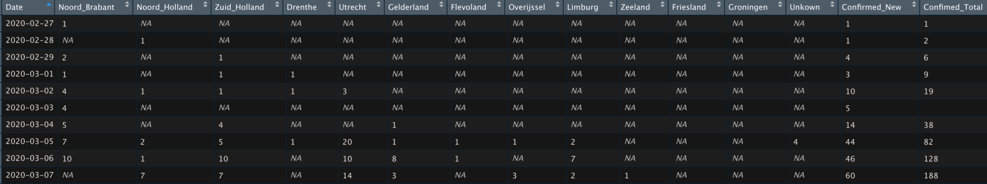
In general I like the iterative approach mentioned Now that all the data is loaded into the R environment we can start with the visual inspection of our data. However before that, and this might be a bit technical. We will need to transform our data to an appropriate unit levels. You might wonder why I am explaining this in detail. The reason is actually simpel and aimed for less 'data science / analytical' readers, where I would like to  stress that 80% of the work generally goes into data collection and preparation and 20% consist of performing the analysis. (Good old Pareto's law)

Data Transformation Principles
Standardisation of data science initiatives can be an important aspect out way of working in order to provide robust en reproducible research. A practical implication in leading data science teams, this means that it is preferable to create a standardised way of working across which all team members work. An important aspect in the process, in that sense can be working with notebooks, in this particular case I would like to pay more attention how to manage your data transformation processes. Keeping in mind Pareto's law we do not want to spend far less than 80% of our available time in data collection and data manipulation. Hence an important principle 'Tidy Data' was introduced by Hadley Wickham in The Journal of Statistical Software, vol. 59, 2014.

"This paper tackles a small, but important, component of data cleaning: data tidying. Tidy datasets are easy to manipulate, model and visualize, and have a specific structure: each variable is a column, each observation is a row, and each type of observational unit is a table. This framework makes it easy to tidy messy datasets because only a small set of tools are needed to deal with a wide range of un-tidy datasets. This structure also makes it easier to develop tidy tools for data analysis, tools that both input and output tidy datasets. The advantages of a consistent data structure and matching tools are demonstrated with a case study free from mundane data manipulation chores" . (Hadley Wickham, The Journal of Statistical Software, vol. 59, 2014)

The reason why I am stressing this point is that concepts as data lakes are gaining more popularity in organisations, as top level executives comprehend that the data landscape is shifting towards a more diversified set of sources that are analysed by data scientists. 
This is no longer limited to classical data sets, but can now also include pictures or audio recordings. 

Bringing us back to the concept of data lakes here I still see a lot of organisations still putting traditional data warehouse logic into. Where they lack to put in an extra layer / environment according to Tidy Data Principles. Implying that you have just provided your team of data scientist across to a lot more data. Generally speaking data scientist are happy with more data, where from a managerial perspective you would also want lead-times for data science products to decrease with the implementation of a data lake. Thus this might also be risky to develop the data warehouse in a fully agile way of working, because of the risk that the Tidy Data environment never makes in to the Most Viable Product phase and will continue to stuck on the back log.

Analysis
After a short side step in terms of the merits of a standardises way of working and data storage principles. It is relative ly easy to create the following histrograms of Epidemic Curves for The Netherlands as a total, and per Province. Implying that this could help us determine if certain regions have a greater contribution to the total nation's increase. And support local intensive care capacity decisions.
Conclusion:
In the introduction we set our the following research question: 
  • How is the epidemic developing in The Netherlands?
  • Are flattening curves effects visible
  • Are there epic centers in the epidemic noticeable in The Netherlands?
Based on the Epidemic Curve for the entire Netherlands an increase is still visible in the amount of daily registered infections, meaning that there are no signs that support claims of positive 'flattening the curve' signals (yet). 

From a local perspective, epic centers of the outbreak were in the South of The Netherlands (Provinces: Limburg and Noord Brabant), expected to be related to yearly carnaval celebrations. Where 2017 numbers show that about 1,5m people attend festivities in the period from 23rd of February to the 25th of February. Implying that the virus could spread more intensely, and thus might give us hope that we caught the spread of the virus at en early stage and by appropriate (governmental) measure are able to influence the change of growth type from linear to exponential. From flattening the cure, carnaval might also have brought it forward and facilitation faster measures!.We do need to take in account that the situation in the Netherlands (at the time of analysing) is still pre-mature and we will need more data to further investigate this hypothesis.

Additionally we also see that numbers are also increasing in Noord Holland and Zuid Holland. Implying that this might implications for intensive care capacity planning in those last two Provinces. As initially Noord Brabant and Limburg were already seen as epic centers and keeping in mind that the number of infections in general is a predictor towards the needed intensive care capacity.
Concluding remarks - not an epidemiologists
Please note that I am not an epidemiologists and thus wary of relating the outcomes of my endeavours to the current situation. My aim is to create a better understanding about the virus and it's outbreak and hopefully help people (and myself) to place presented information in a more statistical perspective. 

Please note that this post has not been peer-reviewed. The sole purpose of my endeavours is to present insights into the outbreak and how with relative some coding in R - it is possible to dive into the data yourself and hopefully get you enthusiastic about the possibilities data science provides.
Hope you enjoyed reading! 

All the best,

Ditty

Ditty Menon, The Data Artists, Ditty

About the Author: Ditty Menon

Founder of The Data Artists, The Data Artists Music and Nederland Wordt Duurzaam


Erasmus University Rotterdam Alumni with 12 years of experience in Data Science / Analytics / Digital. Passionate about incorparating data into all aspects of life & (more recent) using data for a sustainable world.


Radom facts:

Starts his day with a flat white or caffe latte and the financial times podcast.

Broke his glasses when walking into a lamppost while thinking of a coding issue

Loves Serendipity

We use cookies to ensure that we give you the best experience on our website. If you would like to change your preferences you may do so by following the instructions here.
×
Share by: